Design That Delivers: Our Portfolio
At Yōcoya Design, we believe great design is more than just aesthetics—it's a strategic tool that solves problems, connects with audiences, and drives measurable growth. Browse our curated selection of projects to see how we've helped brands like yours elevate their visual identity and achieve their business objectives.
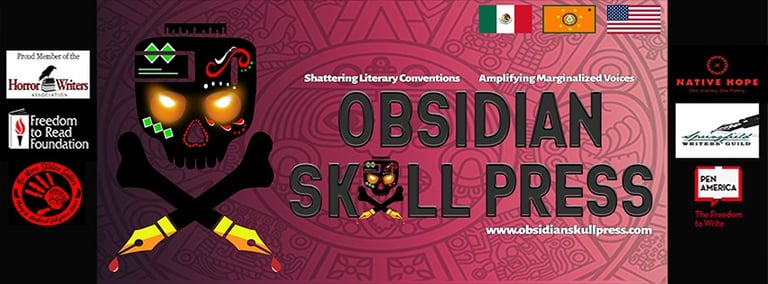
Obsidian Skull Press: Amplifying Voices Through Design & Brand
Springfield, MO | Mexico City, MX
Obsidian Skull Press approached us with a powerful mission: to amplify marginalized voices within the arts and literature. As our sister company, they needed a cohesive brand identity and digital presence that powerfully communicated their core values while honoring their rich cultural heritage.
Category: Logo Design | Brand Identity | Web & UI/UX Design | Digital & Print Marketing Collateral
The Challenge:
Obsidian Skull Press required a comprehensive brand and digital experience that authentically represented their commitment to diverse storytelling. This included:
A Distinctive Brand Identity: Creating a logo and visual language that resonated with their mission while incorporating elements of both Mexican and Cherokee Native American cultures, all with a sophisticated literary feel.
A Captivating Website: Designing and developing a user-friendly website and blog that served as a platform for their published works and a hub for their community.
Effective Marketing Collateral: Developing digital marketing materials to promote their authors and publications.

Our Solution: Weaving Culture, Literature, and Identity
At Yōcoya Design, we embraced the challenge of translating Obsidian Skull Press's unique vision into a compelling visual narrative. Our approach focused on crafting a sophisticated and culturally resonant brand, centered around:


Logo & Brand Identity Design: We developed a striking logo that subtly integrated symbolic motifs from both Mexican and Cherokee Native American traditions, fused with a refined aesthetic befitting a literary press. This foundational element informed a comprehensive brand guide, ensuring consistency across all touchpoints.
Visual Language & Imagery: Our design team curated and created imagery and vector graphics that expertly balanced the vibrant cultural influences with the introspective and artistic nature of literature. This created a visually rich and evocative brand experience.
Website & Blog UX/UI Design: We designed an intuitive and aesthetically pleasing website that prioritized discoverability of their diverse catalog and author profiles. The blog was crafted to be an engaging space for literary discussion and author spotlights, reflecting the press's commitment to community.
Digital Marketing Collateral: We produced compelling digital assets, from social media graphics to promotional banners, designed to effectively communicate the power and significance of Obsidian Skull Press's literary offerings and to attract a wider audience passionate about diverse voices.
The Result:
Through a holistic design and branding strategy, we delivered a visually cohesive and culturally nuanced brand for Obsidian Skull Press. This included a memorable logo, a sophisticated brand identity, and a user-centric website and blog. The resulting digital marketing collateral effectively captures their mission, amplifying their voice and creating a powerful platform for the marginalized artists and writers they champion.
FOCUS 05 DOWNTOWN SUBWAY POSTER ADS
SOHO NEW YORK, NY 2025
Category: Brand Identity Repositioning | Print Collateral Design | Out-of-Home Marketing
The Challenge: A Critical Brand Disconnect
Our client approached us with a significant marketing dilemma: their existing downtown subway poster campaign was failing to resonate with its intended audience. The traditional, text-heavy advertisements, while effective with older demographics, inadvertently spoke to Baby Boomers, completely missing the target market of discerning, urban Millennials.
From a graphic design and branding perspective, the core issue was a visual language that lacked immediacy and aspiration. The designs failed to communicate the values Millennials prioritize: eco-consciousness, health transparency, upscale sophistication, and highly social atmospheres. The visual aesthetic was perceived as dated, resulting in high production costs with negligible brand lift among the 25–40 age demographic.
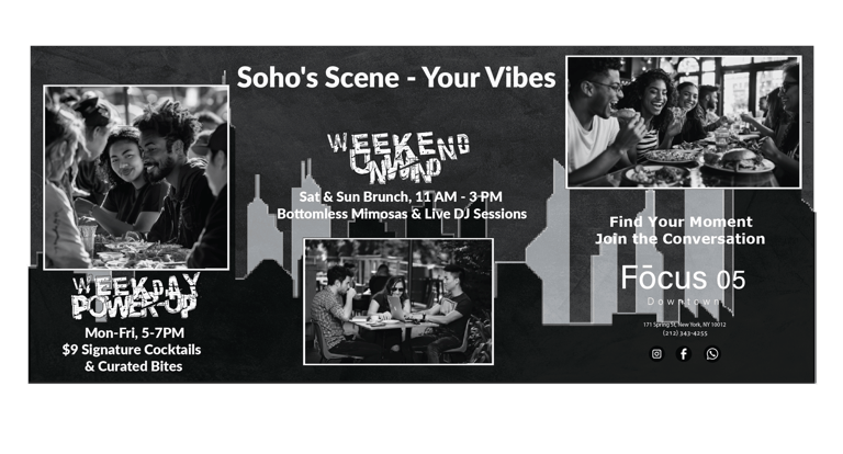
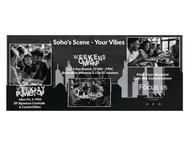

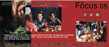


1. Visual Minimalism and High-Impact Imagery: We shifted the design philosophy from informational density to atmospheric aspiration. The new campaign utilized stark minimalism, employing strategic negative space and contemporary, highly saturated imagery. This created visuals that were instantly recognizable in the often chaotic subway environment, prioritizing emotional connection over lengthy explanation.
2. Aesthetic Alignment with Modern Values: We introduced a revitalized color palette featuring muted, earth-toned accents paired with high-contrast metropolitan blacks and whites. Imagery focused exclusively on showcasing aspirational, health-conscious activities and communal settings, utilizing textures and visual cues that imply sustainability and upscale quality.
3. Typography and Message Architecture: We selected a premium, ultra-clean sans-serif typeface to convey sophistication and modernity. Messaging was distilled into concise, impactful headlines that spoke directly to lifestyle benefits. This strategic adjustment ensured that the posters acted less as passive advertisements and more as visual embodiments of an exclusive, desired urban lifestyle.
The result was an Out-of-Home (OOH) campaign that successfully translated the brand’s promise into a compelling, digitally native aesthetic, immediately boosting engagement metrics among the previously unreachable Millennial demographic.
Our Strategic Graphic Solution:
Yōcoya Design was tasked with executing a surgical overhaul of the entire print campaign, focusing on visual psychology and strategic brand repositioning to align the collateral with Millennial values.
OZARKS EXOTIC SCAPES, LLC
SPRINGFIELD, MO 2012 - 2019
Category: Brand Identity | Digital & Print Marketing Collateral
The Challenge: Bridging a Desert Aesthetic with Midwestern Sensibilities
Ozarks Exotic Scapes presented a unique branding paradox. They introduced striking Southwest-style landscape architecture—featuring exotic palms, cacti, and modern hardscape—to a traditional, value-conscious Midwestern market. Their initial identity failed to communicate this niche; a generic, off-the-shelf logo diluted their premium offerings, and their marketing was confined to inconsistent social media with no supporting print collateral. The core challenge was to craft a sophisticated brand identity that would build trust with a conservative demographic while simultaneously appealing to an upscale, trend-forward clientele seeking distinctive outdoor living spaces.
To ensure maximum market penetration, we executed a full-funnel marketing strategy:
Brand Identity: Designed a custom logo, color palette, and typography system that established immediate market credibility.
Print & Promotional Collateral: Produced high-quality trade show banners, tri-fold brochures, and business cards that translated the brand into tangible, professional materials for direct client engagement.
Broadcast Media: Conceptualized and art-directed a suite of TV and radio commercials, with scripts crafted by our editorial team at our sister company, Obsidian Skull Press, to tell a compelling brand story.
Digital Content: Produced, edited, and curated a library of professional video and photo content for social media, showcasing their stunning projects and demonstrating their unique value proposition.
The Result: Elevated Perception and Expanded Reach.
The implementation of a strategic, cohesive brand identity and multi-channel marketing campaign fundamentally transformed Ozarks Exotic Scapes's market presence. They were no longer seen as a novelty but as a premier, trustworthy landscaping expert. The professional collateral empowered their sales team, while the broadcast and digital campaigns significantly expanded brand awareness, successfully attracting both the high-end and the quality-conscious clients they sought. This holistic approach positioned them as the definitive leader in exotic landscape design within their region.
Our Solution: A Cohesive Brand Ecosystem for a Niche Market
We began by developing a custom brand identity from the ground up. The new logo and visual system were designed to feel both premium and approachable, using organic shapes and a refined color palette that echoed the beauty of the desert without feeling out of place in the Ozarks.
COLLEGE PIZZA SUBWAY POSTER AD
New York, NY 2025
Category: Logo Design | Brand Identity | Digital & Print Marketing Collateral
The Challenge: A Disconnected Vision
College Pizza, a New York eatery serving a vibrant community of college students, faced a critical branding disconnect. Their existing visual identity was generic and failed to resonate with their key demographic – budget-conscious college students. Their mission to advocate for the importance of education was also not effectively communicated through their marketing efforts. This lack of a cohesive and targeted brand identity hindered their ability to attract and engage their desired audience.
Our Solution: Crafting a Brand That Connects and Inspires
We recognized the need for a complete brand overhaul to capture the spirit of both delicious, affordable food and the pursuit of knowledge.
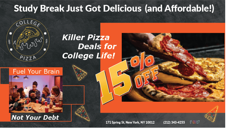


Our approach focused on a multi-faceted design strategy:
Custom Logo Design: We moved away from generic visuals to create a distinctive and memorable logo. This new mark incorporated elements such as neon-style that subtly hinted at the "subway" experience of quick, accessible meals while also referencing academic themes, making it relevant to their mission without being overtly didactic.
Strategic Brand Identity: We developed a vibrant and approachable brand personality that spoke directly to college students. This included a fresh color palette, modern typography, and a visual language that felt energetic and relatable.
Targeted Marketing Collateral: For the "College Pizza Subway Poster Ad," we designed a visually striking and informative piece. Leveraging the new brand identity, the poster was crafted to be eye-catching on campus bulletin boards and in student hubs. Its design prioritized clear messaging about affordable, delicious food options, while subtly integrating the educational advocacy component through compelling visuals and concise copy. We ensured the pricing and value were prominent, directly addressing the budget constraints of the target audience
The Result: A Resonating Brand that Fuels Success
Through this comprehensive design and branding initiative, College Pizza now possesses a visual identity that truly represents its value proposition and its mission. The new logo and collateral are not only aesthetically appealing to college students but also effectively communicate the brand's commitment to affordable dining and educational support. This transformation has positioned College Pizza to better connect with its target audience, fostering a stronger brand recognition and driving increased customer engagement on campus.
The Challenge: Elevating a Cultural Celebration
Our client, Poala, was celebrating the housewarming of her first property with a significant social occasion: a Dia de los Muertos-themed fiesta. While the concept was rich with cultural significance, she lacked the professional brand identity and distribution mechanism necessary to execute the event successfully.
The core challenge was two-fold:
Visual Identity: Creating a sophisticated, modern aesthetic that simultaneously honored the deep cultural heritage of Dia de los Muertos, appealing specifically to a discerning, contemporary audience.
Marketing & Distribution: Developing a high-impact, scalable social media advertisement and invitation system to efficiently notify guests and communicate the event's theme and cultural sensitivity.
Our Solution: Strategic Design & Digital Deployment
We approached this project by first establishing a robust and authentic visual identity that spoke directly to Poala’s personal and cultural values.
1. Strategic Branding & Visual System Development: Our process began with qualitative research into the aesthetic traditions of the celebration, paired with modern design sensibilities. This resulted in the creation of a sophisticated branding system:
Custom Color Palette: We developed an extensive, full-color palette blending traditional marigold tones and deep jewel hues with modern, muted accents, ensuring the design felt both organic and refined.
Typography System: A curated typographic hierarchy was established to convey the event's celebratory tone while maintaining a clean, professional appeal suitable for a high-end social gathering.
Bespoke Illustration Style: We crafted a unique illustration style—applied specifically to the Calavera and font motifs—that balanced intricate detail with modern graphic simplicity, avoiding clichés while maximizing visual integrity.
2. Collateral Creation & Digital Strategy: This cohesive branding system was immediately applied to essential marketing touchpoints, prioritizing the client's need for instant digital communication:
Primary Digital Asset: A comprehensive, high-resolution social media banner ad was developed from the ground up, optimized for immediate engagement and shareability across various digital platforms.
Scalable Templates: We supplied reusable social media asset templates, ensuring future communications (reminders, dress codes) remained visually consistent without requiring further design input.
Print Integration: The system was also adapted for traditional print ads and physical flyers, ensuring brand continuity for local outreach.
The Result: High Engagement & A Distinct Brand Presence
By integrating deep cultural understanding with sophisticated graphic design and targeted digital strategy, we transformed a party notification into a premium social media campaign.
The cohesive visual narrative successfully cut through the noise of standard event invitations, resulting in high RSVP conversion rates and establishing a distinct, memorable brand identity for Poala's housewarming. The client received a comprehensive design system that elevated her celebration from a simple gathering to a highly anticipated, culturally resonant social event in Mexico City.

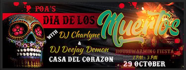
Poala's Dia de los Muertos Fiesta: Cultural Branding & Digital Invitation Strategy
Client: Poala (Private Residence)
Location: Mexico City, MX 2024
Category: Brand Identity | Digital & Print Marketing Collateral | Social Media Strategy
Carrie's Bar: Elevating the Springfield Social Scene
SPRINGFIELD, MO 2025
Category: Logo Design | Brand Identity | 3D Architectural Design | 3D Landscape Design | Digital & Print Marketing Collateral| Mockup
The Challenge: Carrie's Bar in Springfield, MO, faced a significant hurdle: a disconnect between its existing brand and its potential. A generic logo and uninspired marketing efforts failed to capture attention or drive foot traffic. Their social media presence was diminutive and lacked professional polish, and while Google reviews were positive, their reach was limited. This resulted in a narrow customer demographic, potentially deterring a wider audience from discovering the unique experience Carrie's Bar offered. Furthermore, their underutilized outdoor space presented a missed opportunity for generating atmosphere and revenue.
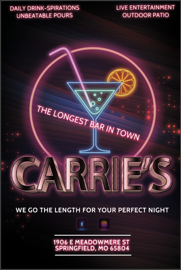
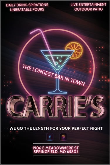


Our Solution: recognized the need for a complete brand and venue transformation. Our approach focused on a holistic graphic design and marketing strategy to elevate Carrie's Bar:
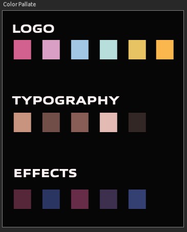
Revitalized Brand Identity: We began by redesigning the logo to exude a classy, upscale image. A sophisticated pastel neon color palette, complemented by a carefully curated supporting sub-palette, was developed to create a memorable and inviting visual identity that spoke to a more discerning clientele.
Strategic Tagline Development: We reimagined their tagline to playfully leverage their claim to the "Longest Bar in Town." The new tagline, "Carrie's Bar: Going the Length for Your Perfect Night Out," strategically implies a commitment to customer satisfaction and an expansive, enjoyable experience.
Immersive Venue Transformation: Our 3D architectural and landscape design services brought their underutilized back patio to life. We envisioned and presented a sophisticated redesign, incorporating an inviting outdoor bar and a fully functional outdoor kitchen area. This reimagined space was designed to extend the bar's appeal and create new revenue streams.
Comprehensive Branding & Marketing Package: We delivered a cohesive Strategic Branding and Venue Transformation Package. This integrated approach ensured that every touchpoint, from digital marketing collateral to print materials, reflected the new upscale identity and promoted the enhanced venue.

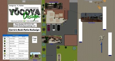


The Result: This was only a mockup presentation. No work was contracted from Carrie's. For example, and visual purposes only.
Proposed Result: The strategic integration of sophisticated graphic design, a revitalized brand identity, and a comprehensive venue transformation package would position Carrie's Bar for significant growth. The new visual language would attract a broader demographic, while the reimagined outdoor space would invite a more engaging and extended customer experience. This holistic approach would transform Carrie's Bar into a premier destination in Springfield, MO, ready to welcome a new era of success.
LA CESTA BOUTIQUE | Elevating Mexican Heritage in High-End Retail Branding
Location: Mexico City, MX (2024)
Category: Logo Design | Brand Identity System | Digital & Print Collateral
Project Overview
La Cesta Boutique, a new luxury clothing retailer located strategically near Mexico City’s historic Zócalo, sought a complete visual identity that could stand alongside the area’s high-end shops while authentically honoring their deep appreciation for Mexicana culture and heritage.
The Challenge: Balancing Heritage and Luxury
As a startup, La Cesta required a comprehensive branding suite from scratch. The core graphic design challenge was dual in nature:
Cultural Congruence: The identity needed to authentically respect and integrate Mexicana heritage, requiring a designer with a nuanced understanding of cultural symbolism and aesthetic inferences.
Market Positioning: Located in a prime, high-traffic retail area, the brand identity had to project an upscale, elegant, and sophisticated image to appeal directly to the Zócalo’s elite shopping demographic. We needed to avoid clichés and create a visual language that felt both deeply rooted and globally luxurious.
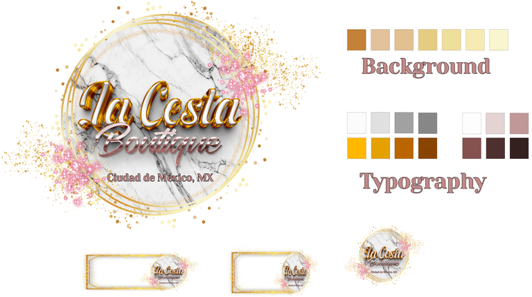
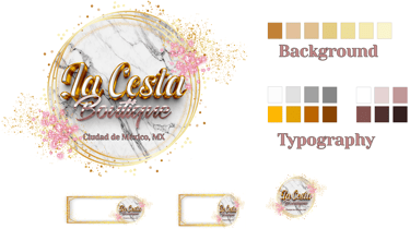
Our Solution: Strategic Cultural Immersion and Elevated Design
Our approach focused on creating a bespoke visual identity system that married modern luxury design principles with strategic cultural motifs. We leveraged our lead designer’s heritage and deep understanding of Mexican aesthetics to inform every design decision.
Key Graphic Design Deliverables:
Logo Development: We developed a streamlined logo that subtly integrates traditional craft structure (the "cesta" or basket) through elegant linework and custom, luxurious typography. The mark is evocative of artisanal quality yet rendered with minimalist sophistication.
Color Palette: We established a commanding color scheme featuring deep, rich accent tones (e.g., oxidized copper and terracotta) balanced with creamy neutrals and metallic gold, immediately communicating exclusivity and cultural warmth.
Visual Identity System: We designed a flexible asset system, ensuring that the brand’s sophisticated voice translated seamlessly across all touchpoints, from digital media to physical packaging.
Print Collateral: We designed a complete suite of printed materials using high-quality finishes (embossing, letterpress) for shopping bags, hang tags, stationary, and lookbooks, ensuring every item reinforced the boutique's high-end status.
The Result
La Cesta Boutique successfully launched with a powerful, cohesive, and exceptionally sophisticated brand identity. The integrated design system achieved the necessary cultural resonance while positioning the startup firmly within the competitive, luxury retail landscape of the Zócalo, ready for immediate market recognition and sustained growth.
AMETHYST BAY RESORT & SPA
ST. THOMAS, VIRGIN ISLANDS 2023
Category: Logo Design | Branding Identity | Digital & Print Marketing Collateral (Magazine Ad)
The Challenge: Amethyst Bay Resort & Spa sought to elevate its brand presence with a luxurious magazine ad designed to drive direct customer bookings. The challenge involved refining an existing logo and color palette to better convey a high-end atmosphere, establishing a cohesive visual identity that exuded luxury, and strategically integrating stunning local and amenity photography within a compelling print layout that incorporated clear calls-to-action.
Our Solution: Our approach began with a meticulous refinement of Amethyst Bay's existing logo and color palette. We modernized its aesthetic while preserving its core essence, creating a sophisticated brand guide that ensured consistency across all touchpoints.
For the magazine ad, we crafted an elegant layout featuring refined typography, a judicious use of negative space, and compelling visual hierarchy. We curated and art-directed high-resolution photography of St. Thomas's breathtaking scenery and the resort's exclusive amenities, ensuring each image communicated aspirational luxury. Strategic placement of clear, yet sophisticated, calls-to-action were integrated seamlessly, guiding potential guests toward booking their escape. The design balanced visual grandeur with functional marketing imperatives, creating a piece that was both beautiful and effective.
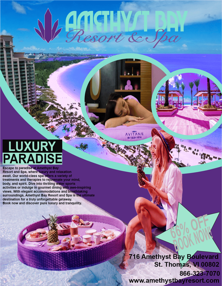

The Result: The result was a captivating magazine ad, a pristine reflection of the Amethyst Bay luxury experience. This enhanced print collateral not only elevated the resort's brand perception but also provided a powerful, direct-response marketing tool, successfully converting interest into bookings and positioning Amethyst Bay as a premier destination in the Virgin Islands. The refined branding armed the resort with a consistent, luxurious visual language for future marketing efforts.
Show-Mo Jerky – Brand Identity & Packaging Design
Category: Brand Strategy | Logo Design | Packaging Design | Marketing Collateral
SPRINGFIELD, MO 2025
The Challenge: A Premium Product Lost on the Shelf
Show-Mo Jerky crafts exceptional, small-batch beef jerky, but its visual identity told a different story. The existing branding lacked cohesion and failed to communicate its premium quality. The packaging struggled to compete in a crowded market, and the marketing materials felt disconnected from the artisanal nature of the product. They needed a complete brand transformation to resonate with a modern, discerning audience and visually articulate their story of craftsmanship and local pride.
Our Solution: A Cohesive Brand System Rooted in Craft & Place
We architected a comprehensive brand identity from the ground up, beginning with a strategic deep dive into their core values. The solution is a sophisticated visual system that feels both rugged and refined, directly reflecting their handcrafted quality.
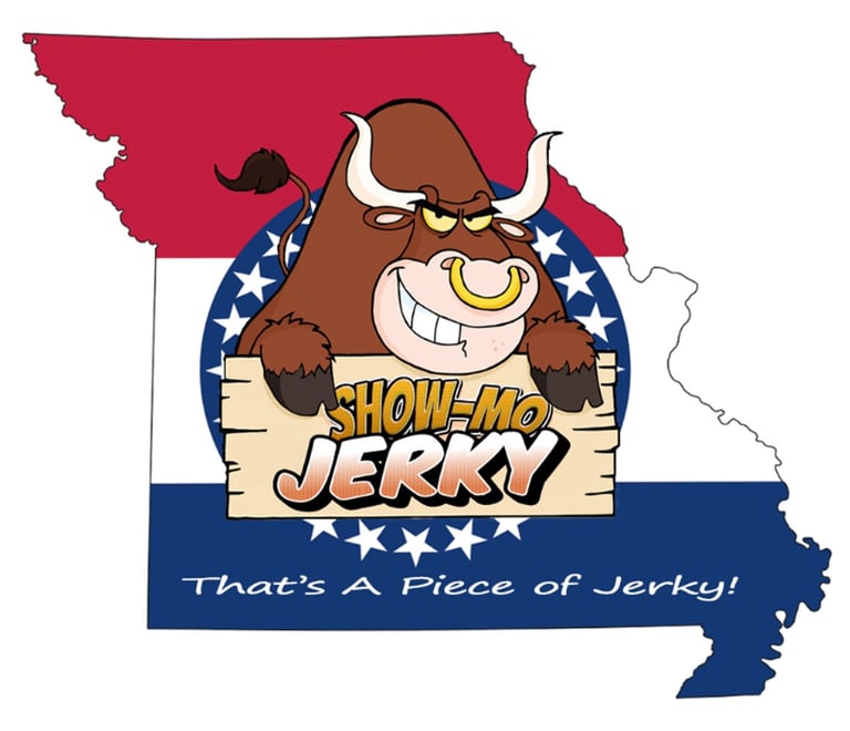
Strategic Logomark: The new logo elegantly merges geography with craft. A custom "Man's-Man" Bull suggests strength of product quality and the rolling Ozark hills. At the same time, a prominent Missouri State silhouette in the state colors for a backdrop, accented by a ring of its stars, speaks directly to the product’s heritage. This creates a memorable and ownable symbol of their Springfield, "Show Me" MO roots.
Artisanal Visual Language: We developed a rich, patriotic color palette and paired strong, confident typography with organic illustration textures. This combination visually communicates the handcrafted, premium nature of the jerky, setting it apart from mass-produced competitors.
Unified Application: This new system was designed to be meticulously applied across all key touchpoints to ensure a consistent and premium brand experience:
Primary & Secondary Packaging
Digital & Print Advertising
Product Catalogs & Sales Sheets
Branded Environmental Elements
The Result: We are still waiting to hear the results once Show-Mo Jerky opens its new production line.
Our Proposed Result: A Brand That Sells Itself
The revitalized identity would immediately elevate Show-Mo Jerky’s market presence. The packaging would command attention on the shelf, clearly communicating its premium quality. The cohesive suite of marketing collateral will provide a powerful and professional toolset for sales and growth, finally giving a worthy visual identity to an outstanding product.
Elevate Your Design Journey with AIGA!
Looking to propel your design career to new heights? Discover AIGA, The Professional Association for Design. AIGA is dedicated to advancing design as a professional craft and advocating for its impact.
As the leading voice for design, AIGA offers unparalleled opportunities to:
Connect with a vibrant, supportive community of fellow designers.
Learn through expert-led events, resources, and insights.
Grow your skills, find mentorship, and explore career-advancing opportunities.
Advocate for the power and value of design in business and society.
At Yocoya Design, we are proud members of AIGA. We continually benefit from the invaluable resources, professional development, and sense of community they provide, helping us stay at the forefront of the design industry.
Ready to unlock your full design potential? Learn more about AIGA today!
Contact
Follow
© TL Hutton | Yōcoya Design 2025. All rights reserved.